MAG. ST
LOGO REDESIGN
RESTAURANT BRANDING
Concept Design
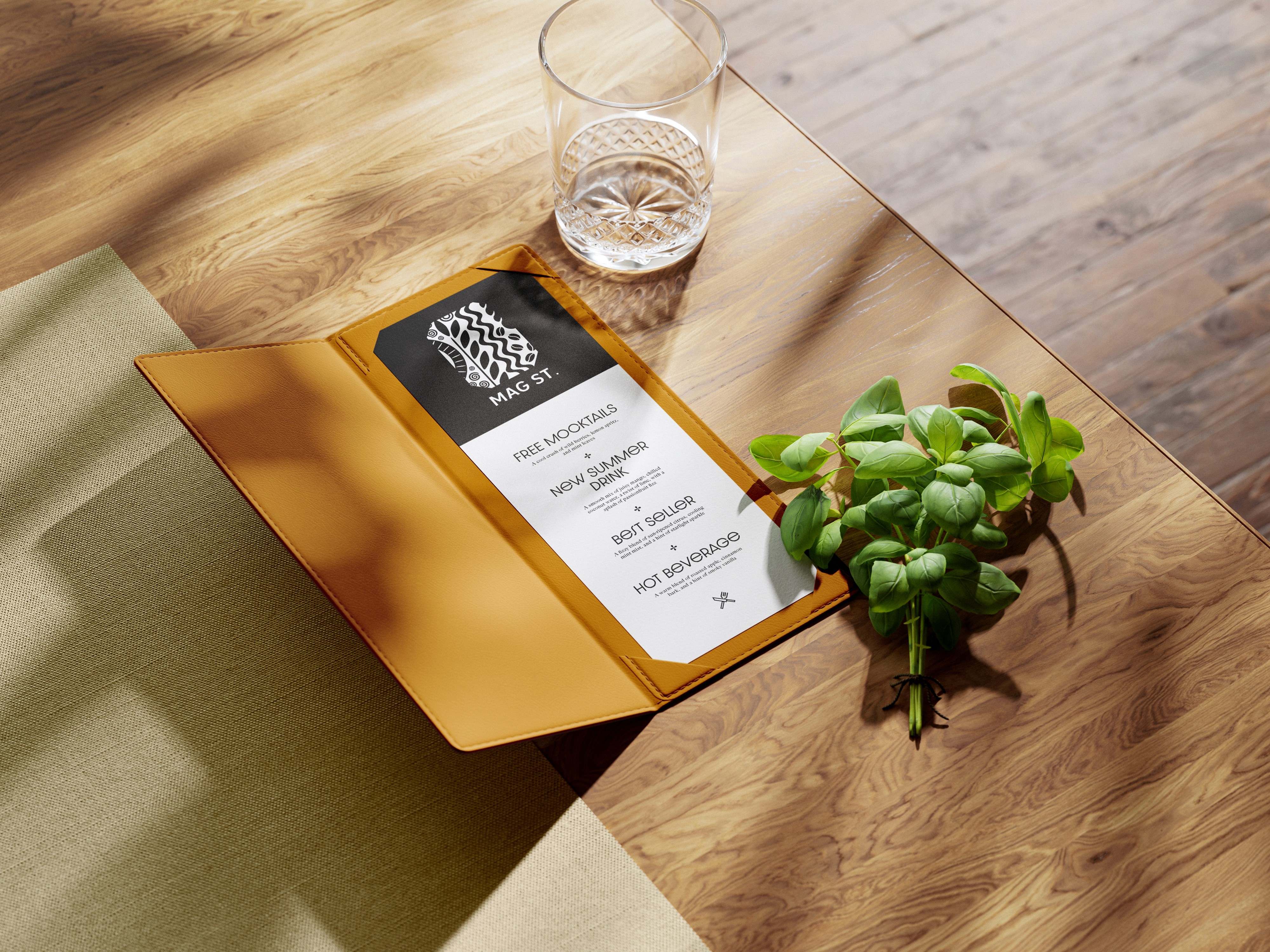
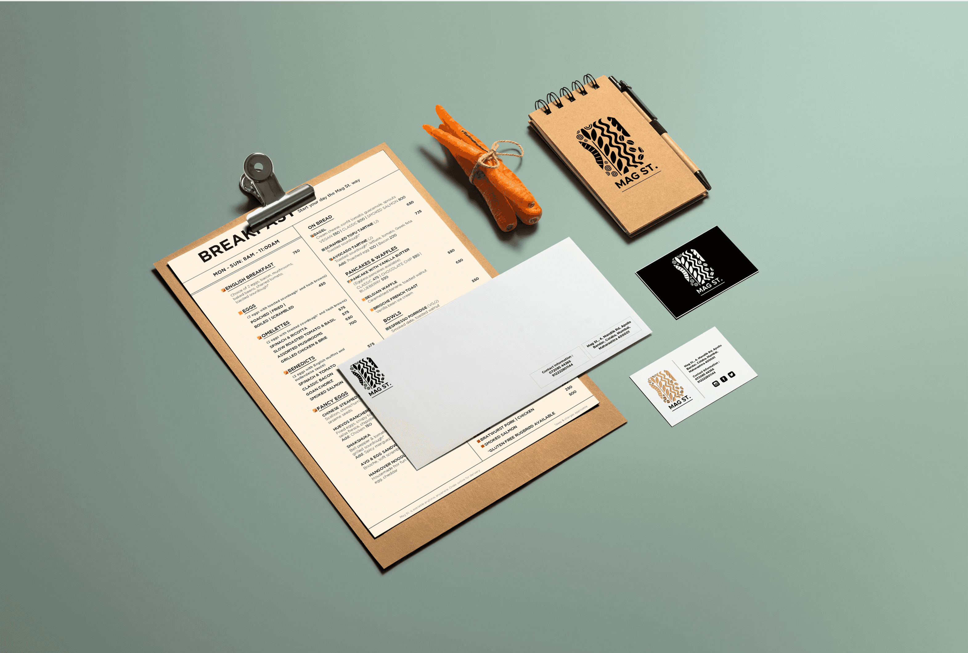
The MAG ST logo is a dynamic representation of the restaurant’s philosophy, encapsulating the journey from raw ingredients to beautifully plated dishes. The intricate design elements symbolize the essential aspects of the culinary process. The seeds and leaves reflect fresh, high-quality ingredients, while the swirling patterns and flowing lines represent the artistry and movement of cooking. The rhythmic waves and bold contrasts evoke the harmony and precision involved in plating and presentation.
About MAG ST.
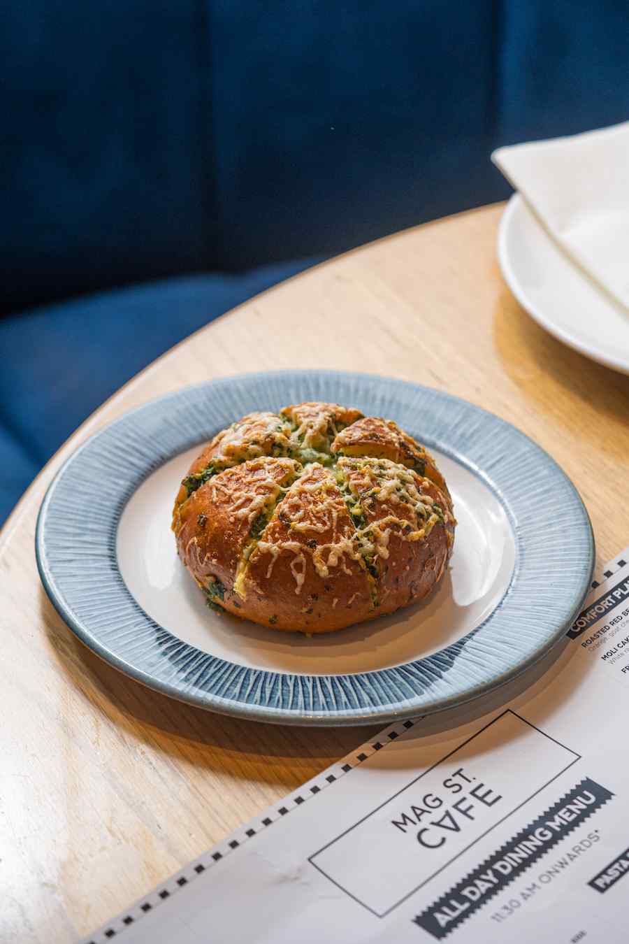
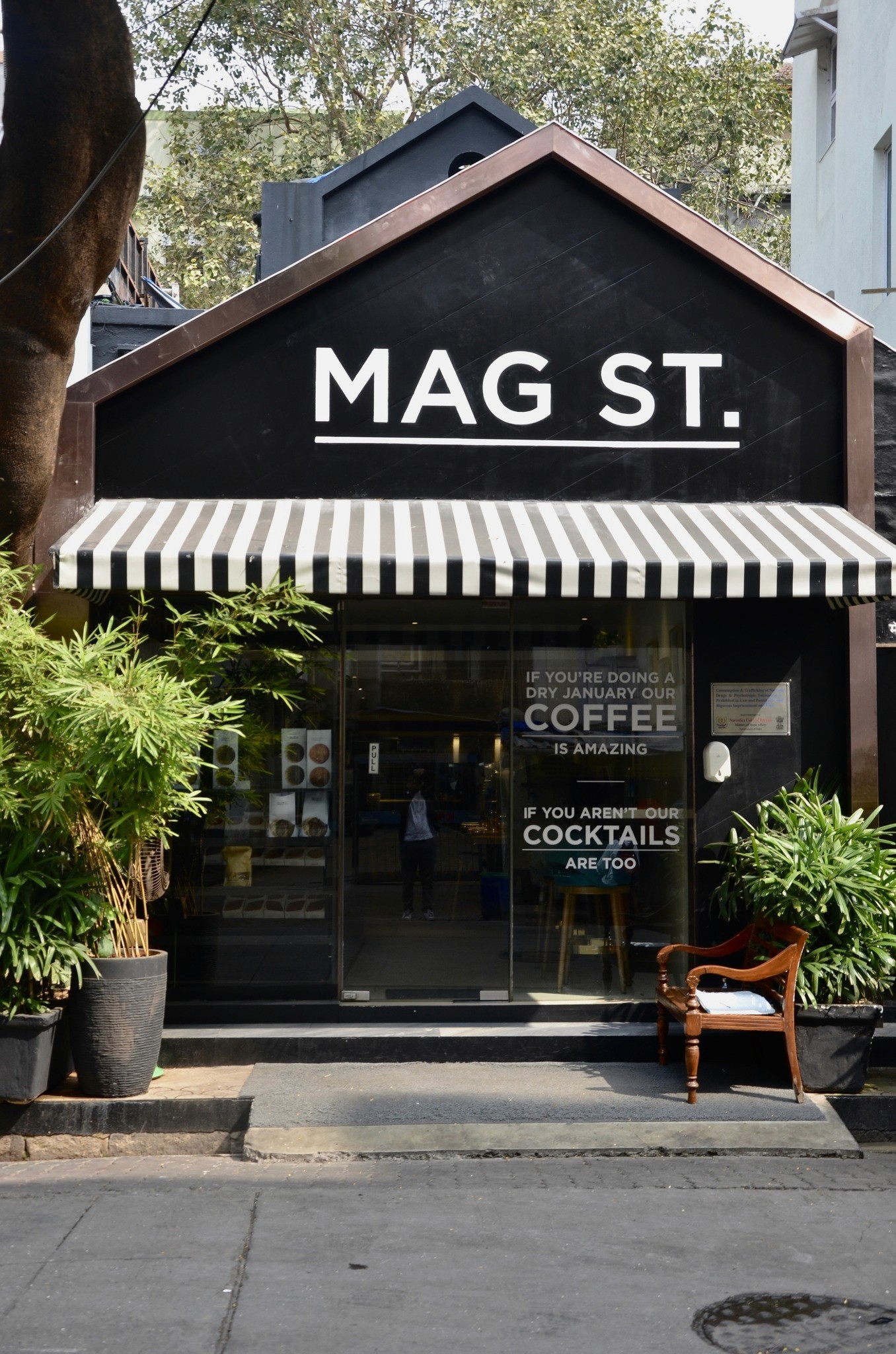
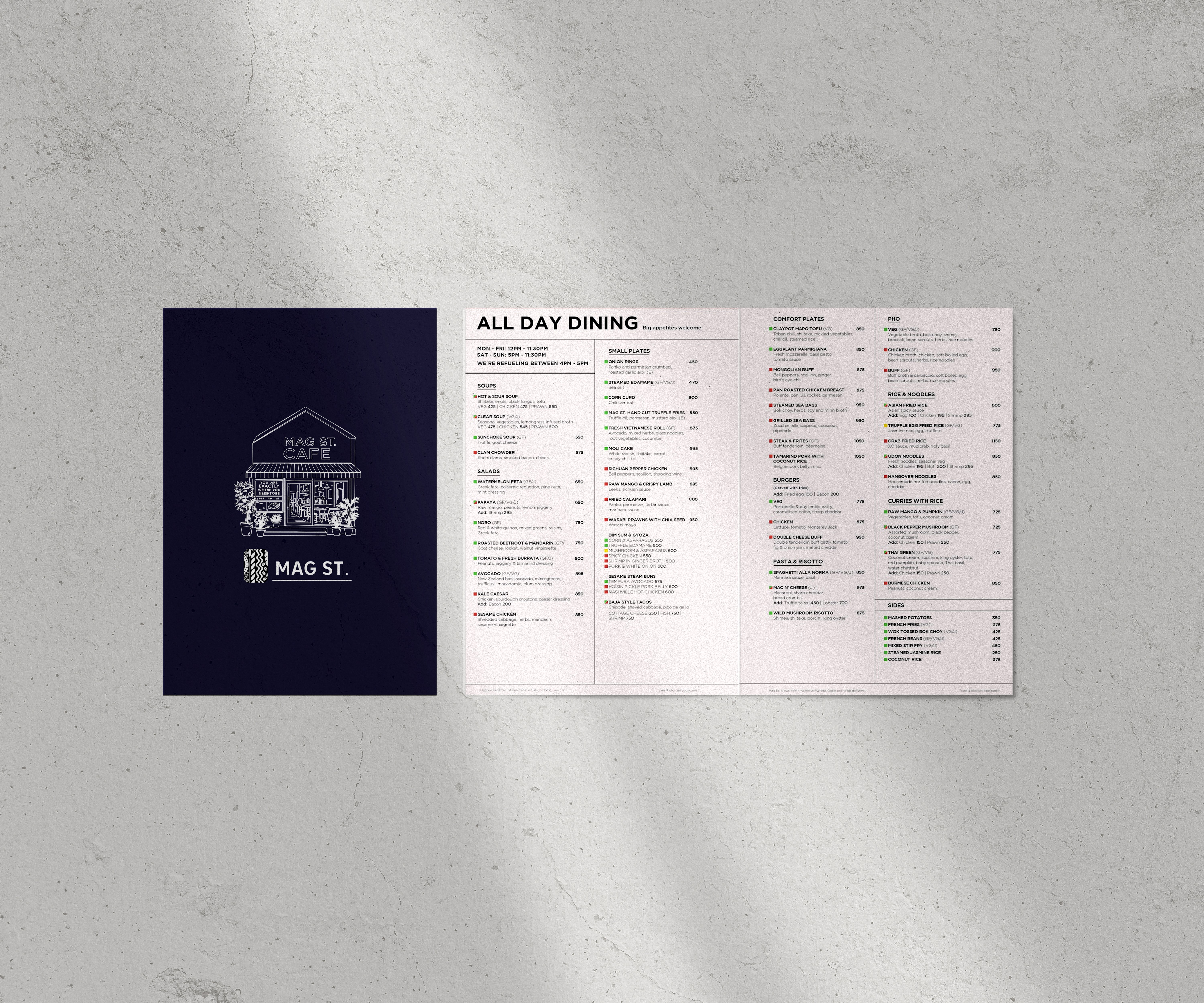
Mag St. Is committed to offering the best comfort food with a creative twist. With three outlets – 24th Road – Bandra, Mandlik Road – Colaba and One Lodha Place – Lower Parel, it has become a favourite among the community, and the go-to place for all meals and all age groups.
Logo exploration
Initial sketches focused on integrating natural motifs, such as leaves and coffee beans, with abstract shapes representing movement and harmony. Different layouts and patterns were explored to create a visual flow that symbolized the transformation of raw ingredients into artful dishes. The aim was to maintain a balance between intricate detail and a clean, modern aesthetic.
MaG St. ReBranding
The logo blends personality with quiet sophistication, reflecting MAG ST.’s creative approach to flavour and shared dining. The black-and-white palette keeps the identity refined and approachable, while warm ochre, muted blue and soft grey add depth and character, creating a visual world that feels stylish, warm and full of life.


MAG. ST
LOGO REDESIGN
RESTAURANT BRANDING
Concept Design
The MAG ST logo is a dynamic representation of the restaurant’s philosophy, encapsulating the journey from raw ingredients to beautifully plated dishes. The intricate design elements symbolize the essential aspects of the culinary process. The seeds and leaves reflect fresh, high-quality ingredients, while the swirling patterns and flowing lines represent the artistry and movement of cooking. The rhythmic waves and bold contrasts evoke the harmony and precision involved in plating and presentation.
About MAG ST.
Mag St. Is committed to offering the best comfort food with a creative twist. With three outlets – 24th Road – Bandra, Mandlik Road – Colaba and One Lodha Place – Lower Parel, it has become a favourite among the community, and the go-to place for all meals and all age groups.
Logo exploration
Initial sketches focused on integrating natural motifs, such as leaves and coffee beans, with abstract shapes representing movement and harmony. Creating a visual flow that symbolized the transformation of raw ingredients into artful dishes. The aim was to maintain a balance between intricate detail and a clean, modern aesthetic.
MaG St. ReBranding
The logo blends personality with quiet sophistication, reflecting MAG ST.’s creative approach to flavour and shared dining. The black-and-white palette keeps the identity refined and approachable, while warm ochre, muted blue and soft grey add depth and character, creating a visual world that feels stylish, warm and full of life.