Loopin
UI/UX
App Design
Concept Design
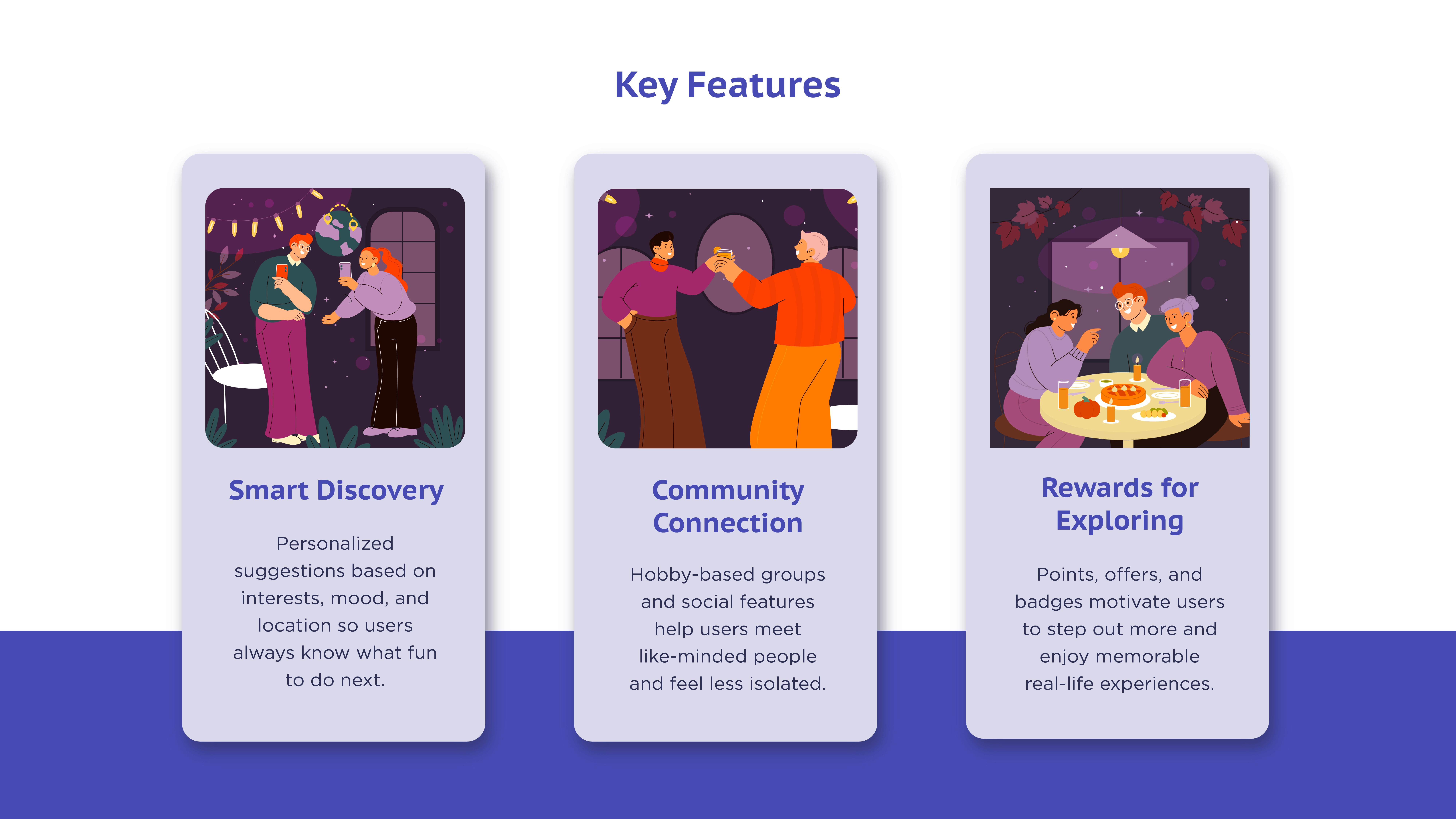
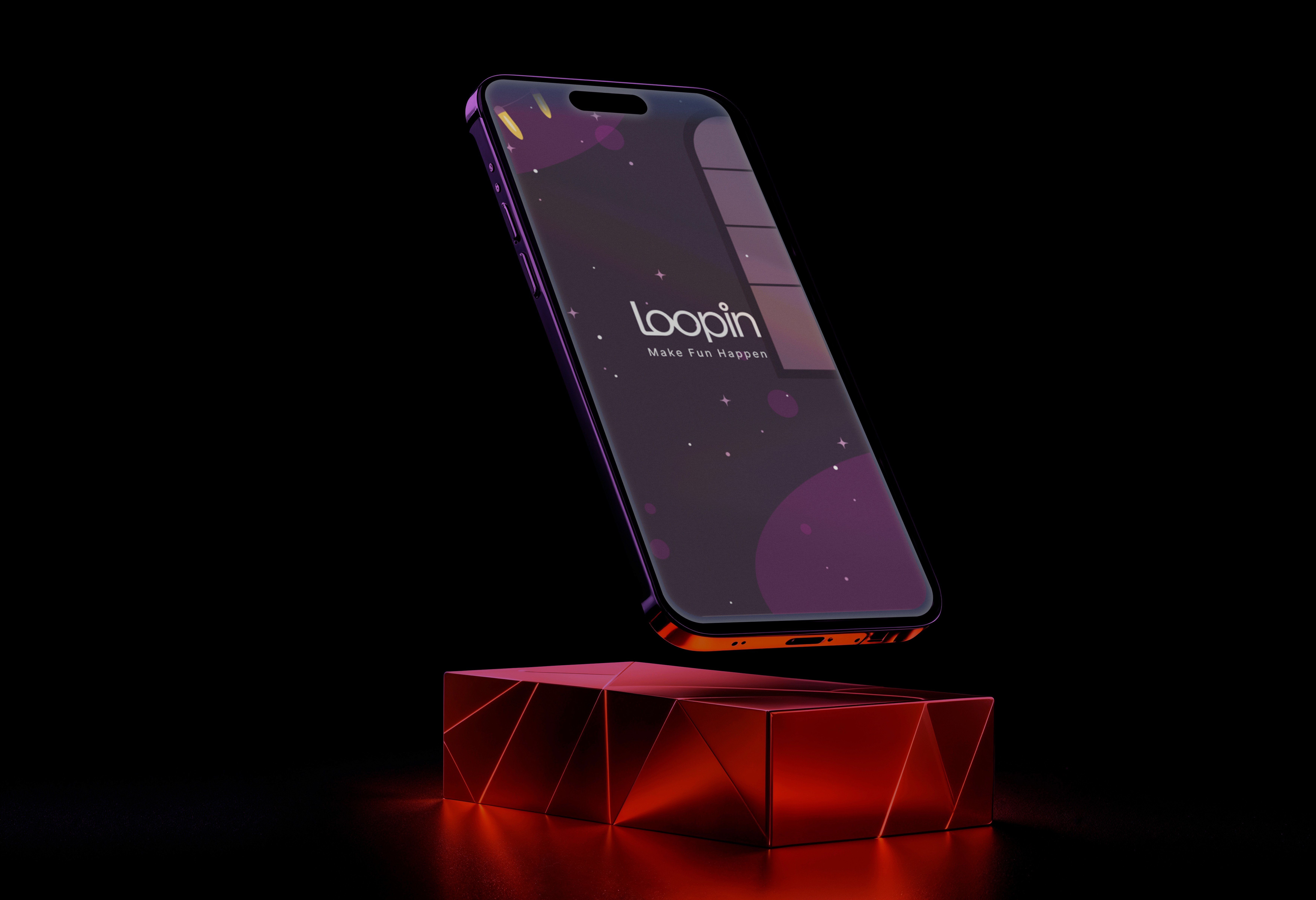
Loopin is designed to help people turn boredom into excitement by discovering events, hidden places, and new communities around them. Whether someone is new to the city or just wants better weekend plans, Loopin makes exploring fun, rewarding, and e ortlessly social.
Mood Board
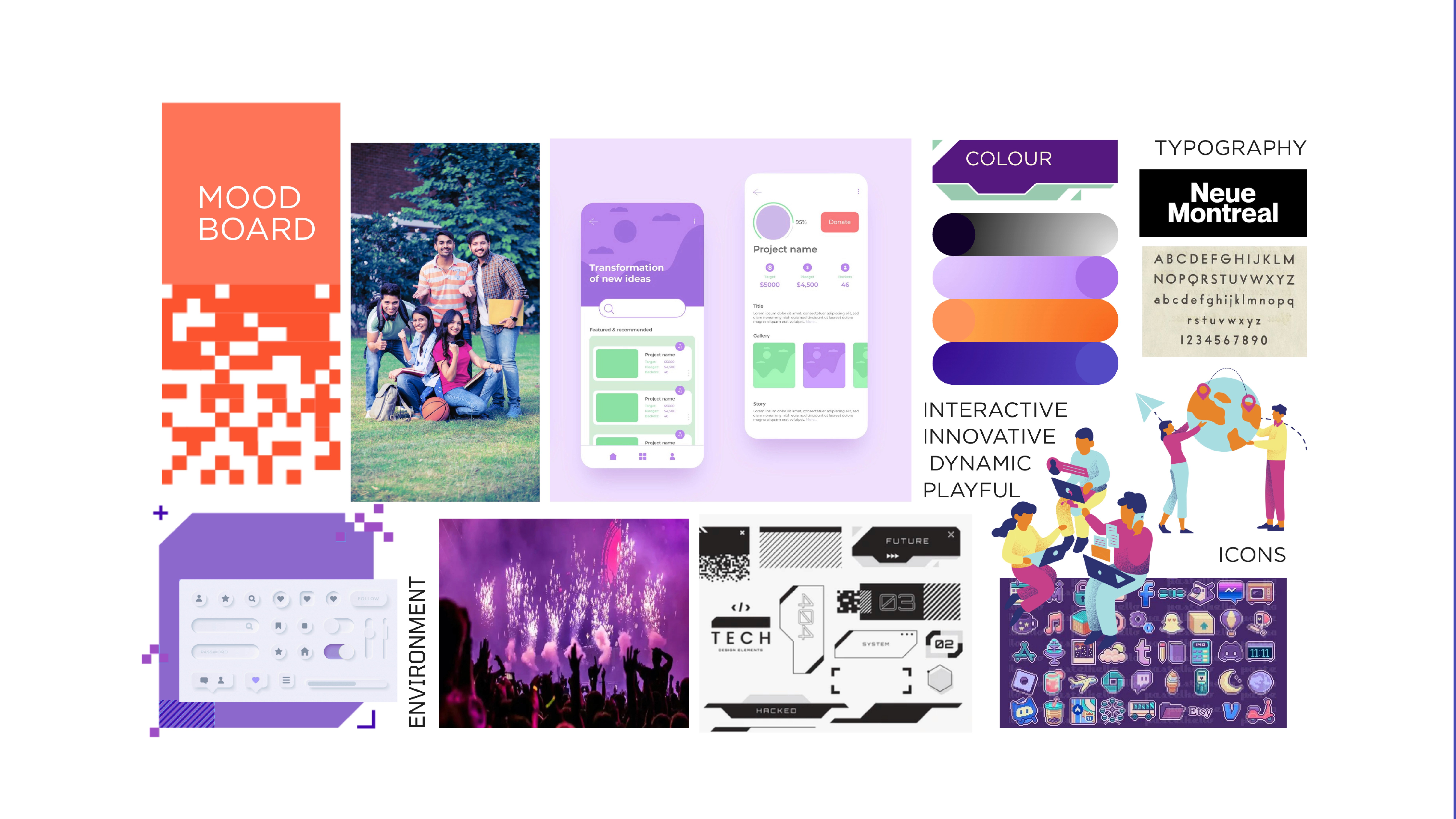
The moodboard sets the tone for Loopin’s energetic and youthful identity. Bright gradients, playful illustrations and tech-inspired elements that feel interactive and dynamic. The palette blends modern purples and oranges to create a lively digital atmosphere, while clean typography keeps everything sharp and approachable.
SiteMap and User journey
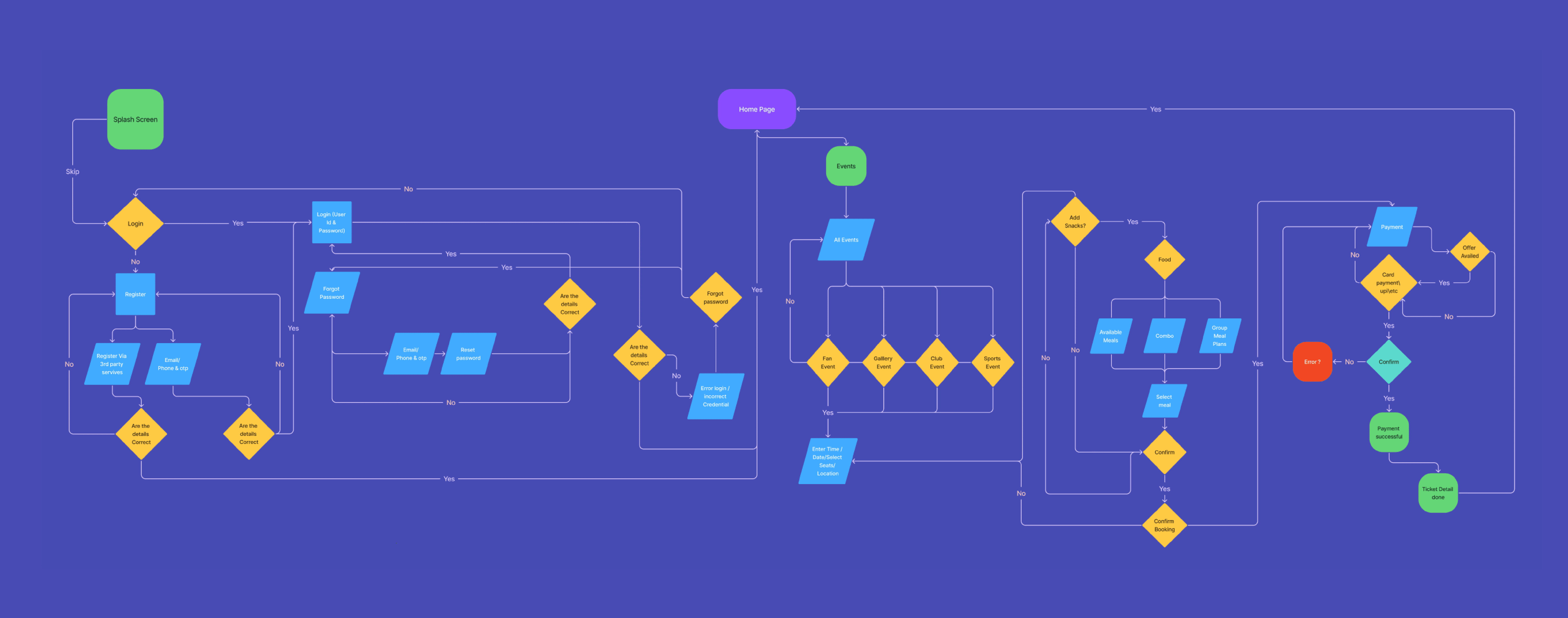
The sitemap maps out Loopin’s full structure from discovering events and hidden spots to booking, joining communities and earning rewards, with a separate flow for organisers to create and manage events. The user journey begins at the splash screen, moves through login or registration, leads users to browse events on the homepage, customise bookings, add extras and finally complete secure payment with available offers.
Figma Link
Low Fidelity wireframe
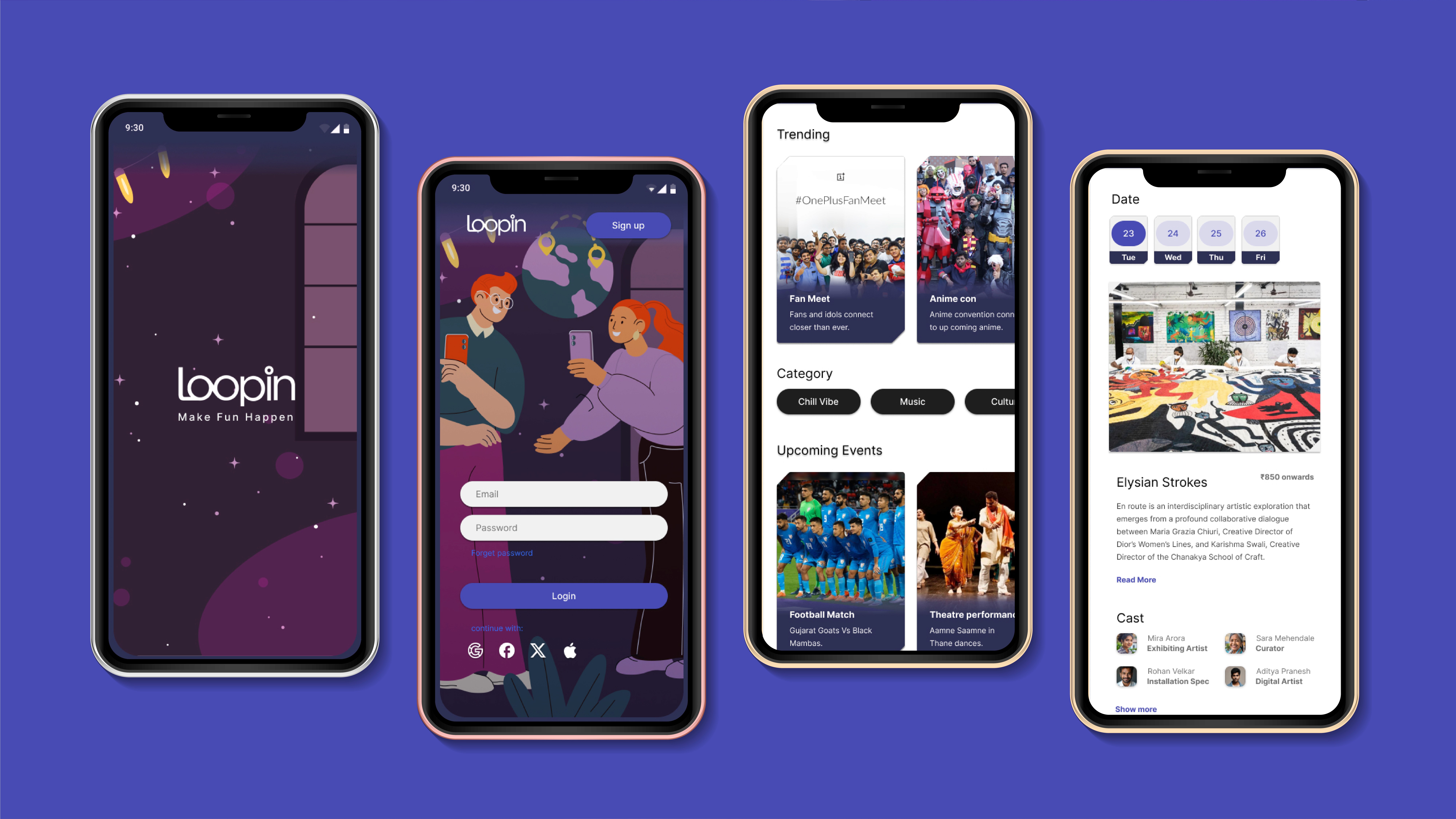
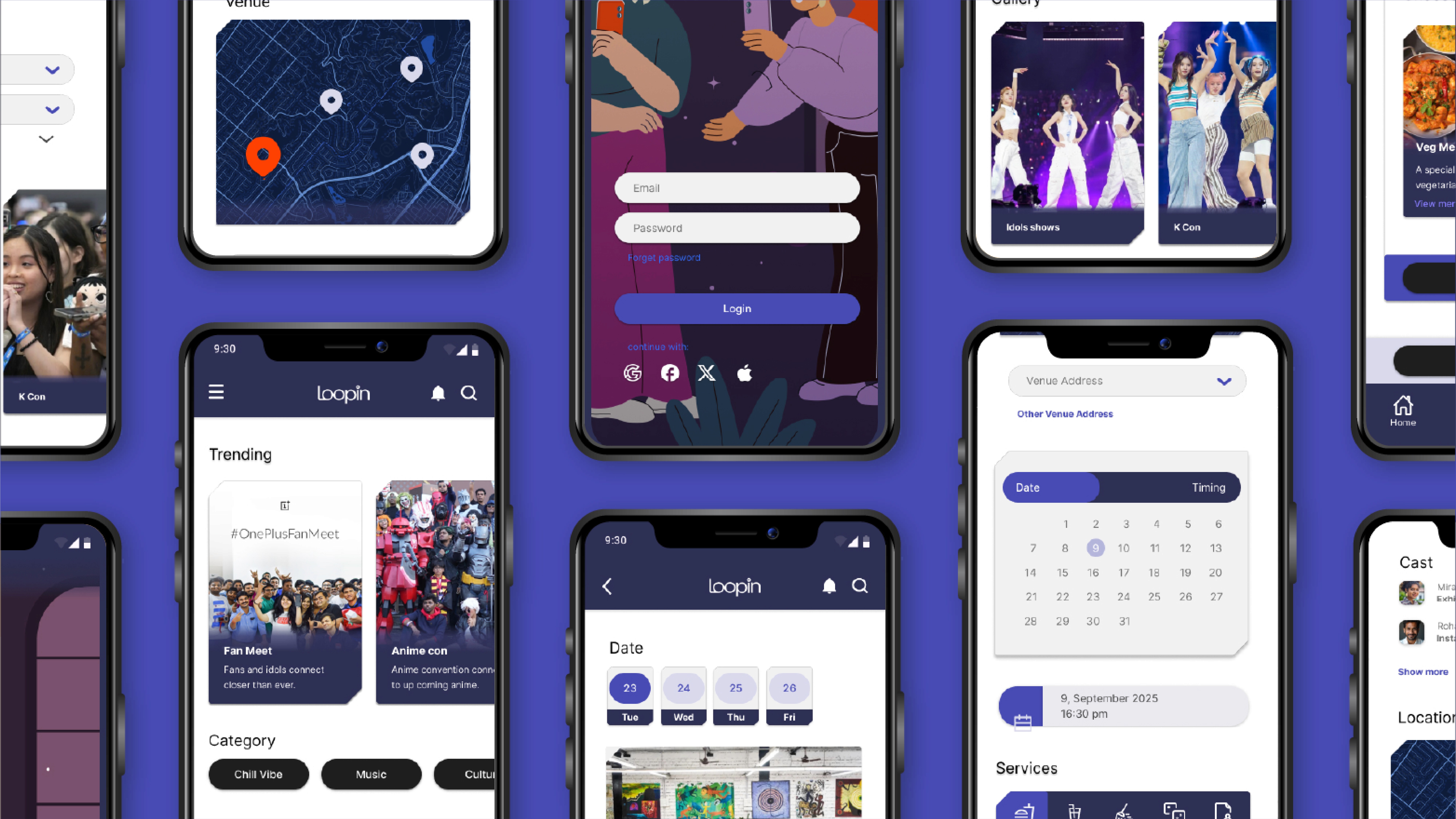
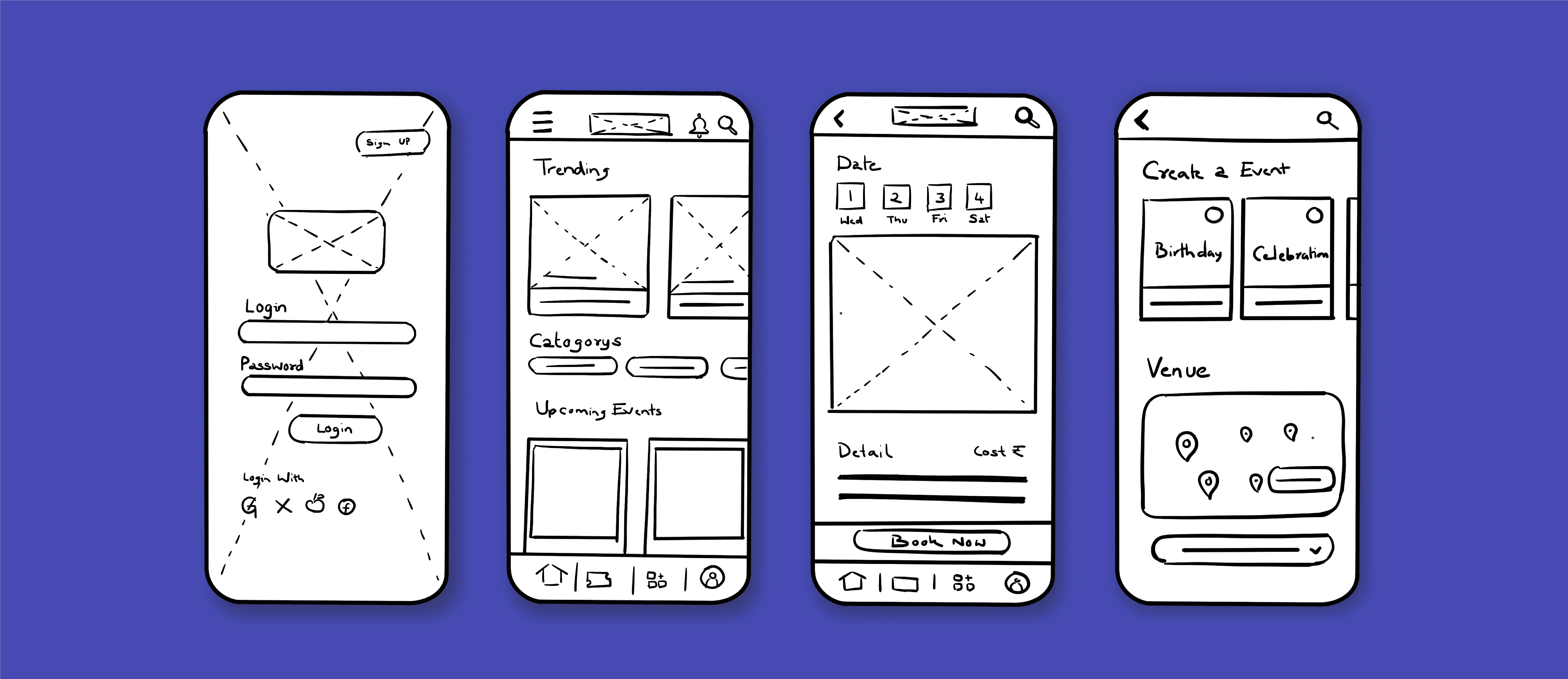
These low-fidelity wireframes form the first visual translation of the concept, mapping out how users move through key screens like login, home feed, event details and event creation. They explore how users will navigate, discover events and take quick actions, setting the foundation for a smooth and intuitive app experience.
Loopin Branding
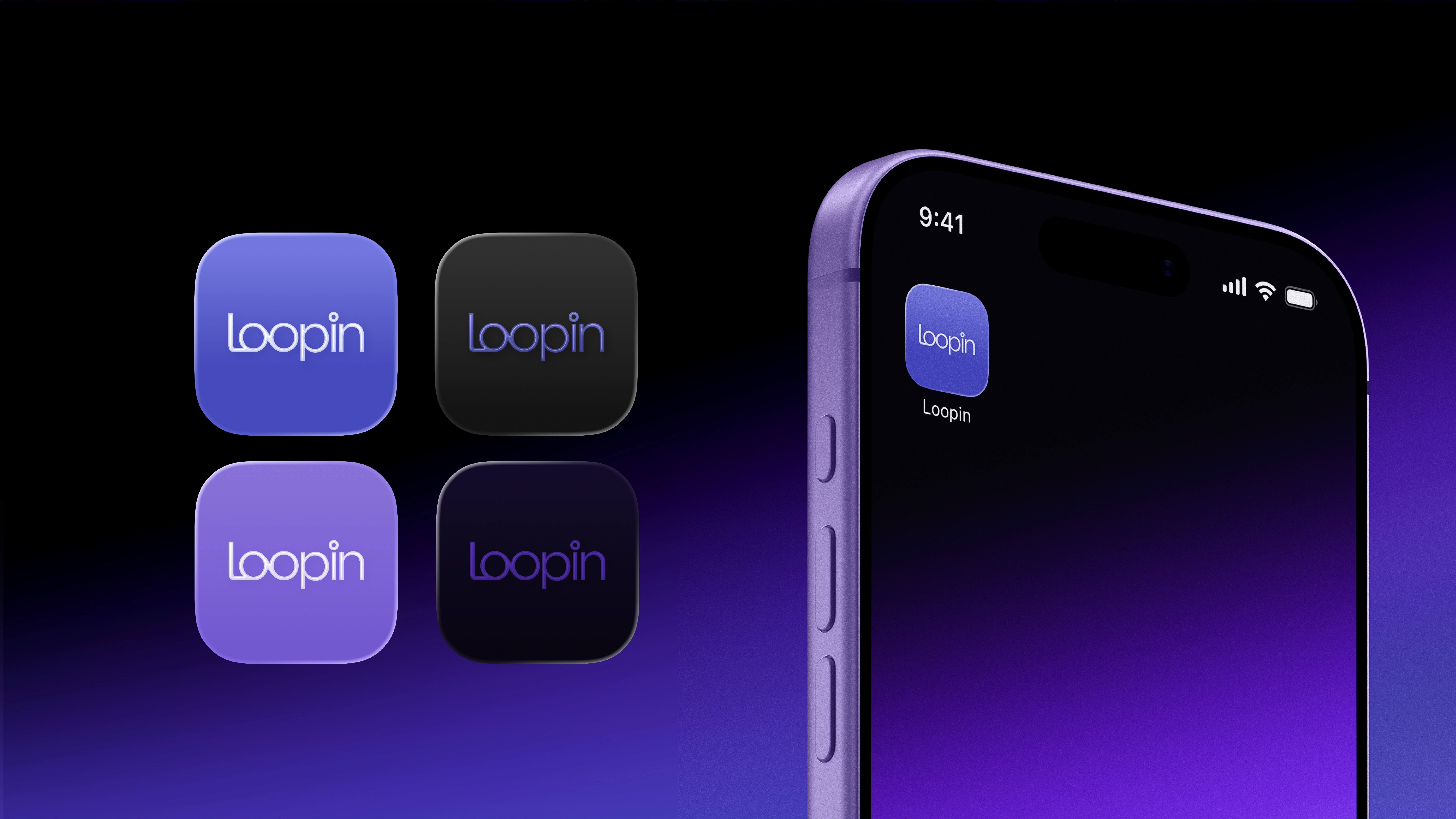
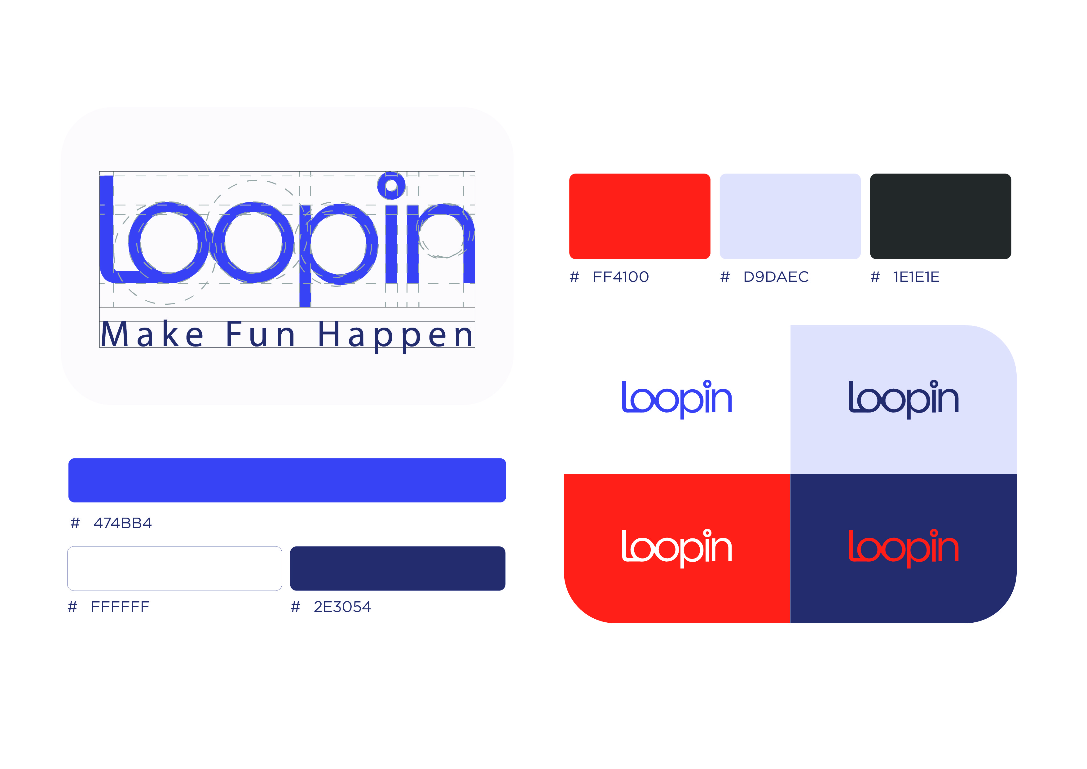
The Loopin logo is built on smooth geometric forms that echo the idea of movement, loops and flow, giving the brand a playful yet modern character. Its colour palette mixes energetic orange with cool purples, grounded by soft neutrals and deep navy, creating a balance between excitement and clarity.
Loopin Mockup


Loopin
UI/UX
App Design
Concept Design
Loopin is designed to help people turn boredom into excitement by discovering events, hidden places, and new communities around them. Whether someone is new to the city or just wants better weekend plans, Loopin makes exploring fun, rewarding, and e ortlessly social.

Mood Board
The moodboard sets the tone for Loopin’s energetic and youthful identity. Bright gradients, playful illustrations and tech-inspired elements that feel interactive and dynamic. The palette blends modern purples and oranges to create a lively digital atmosphere, while clean typography keeps everything sharp and approachable.

SiteMap and User journey
The sitemap maps out Loopin’s full structure from discovering events and hidden spots to booking, joining communities and earning rewards, with a separate flow for organisers to create and manage events. The user journey begins at the splash screen, moves through login or registration, leads users to browse events on the homepage, customise bookings, add extras and finally complete secure payment with available offers.
Figma Link

Low Fidelity wireframe
These low-fidelity wireframes form the first visual translation of the concept, mapping out how users move through key screens like login, home feed, event details and event creation. They explore how users will navigate, discover events and take quick actions, setting the foundation for a smooth and intuitive app experience.


Loopin Branding
The Loopin logo is built on smooth geometric forms that echo the idea of movement, loops and flow, giving the brand a playful yet modern character. Its colour palette mixes energetic orange with cool purples, grounded by soft neutrals and deep navy, creating a balance between excitement and clarity.
Loopin Mockup



Loopin
UI/UX
App Design
Concept Design
Loopin is designed to help people turn boredom into excitement by discovering events, hidden places, and new communities around them. Whether someone is new to the city or just wants better weekend plans, Loopin makes exploring fun, rewarding, and e ortlessly social.

Moodboard
The moodboard sets the tone for Loopin’s energetic and youthful identity. Bright gradients, playful illustrations and tech-inspired elements that feel interactive and dynamic. The palette blends modern purples and oranges to create a lively digital atmosphere, while clean typography keeps everything sharp and approachable.

SiteMap and User journey
The sitemap maps out Loopin’s full structure from discovering events and hidden spots to booking, joining communities and earning rewards, with a separate flow for organisers to create and manage events. The user journey begins at the splash screen, moves through login or registration, leads users to browse events on the homepage, customise bookings, add extras and finally complete secure payment with available offers.
Figma Link

Low Fidelity wireframe
These low-fidelity wireframes form the first visual translation of the concept, mapping out how users move through key screens like login, home feed, event details and event creation. They explore how users will navigate, discover events and take quick actions, setting the foundation for a smooth and intuitive app experience.


Loopin Branding
The Loopin logo is built on smooth geometric forms that echo the idea of movement, loops and flow, giving the brand a playful yet modern character. Its colour palette mixes energetic orange with cool purples, grounded by soft neutrals and deep navy, creating a balance between excitement and clarity.
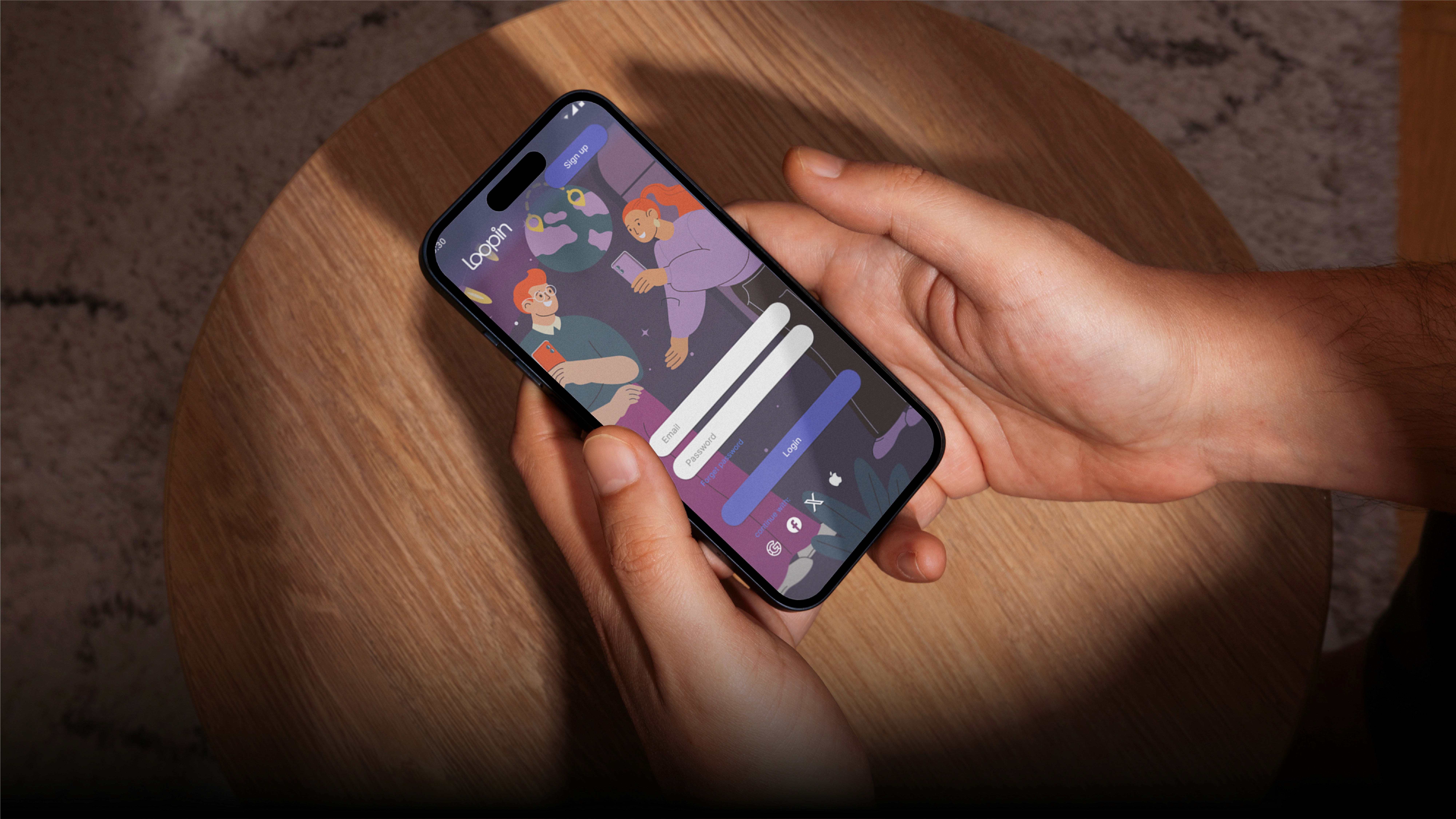
Loopin Mockup
